Books and Bookmaking
It is often stated that textual criticism of the Bible ends when the era of printed books begins; from that time on, there is no new evidence available. This is largely true -- but not entirely. It is true enough that the first printed New Testament, Erasmus's edition which eventually led to the Textus Receptus, is derived from manuscripts we know, and thus it has no value. The earliest printed Latin Bible is almost equally useless; while the source manuscripts are not known, the text is typical of Paris Bibles, which is a late, not very good type.
And yet, there are occasional reasons to care about printed editions, sometimes of the Bible and more often of other ancient writings. Early editions of works such as Josephus or Chaucer frequently take us back to manuscripts we no longer have. Indeed, even the Textus Receptus had value of this sort for a time; 1r, the manuscript used to compile the Apocalypse, was lost for many years. In addition, some of the early critical editions refer to manuscripts which are now lost -- some of them, indeed, quite interesting, such as 1518 (a member of Family 2138, which has probably but not certainly been recovered) or the Latin codex Demidovianus (never recovered).
Plus there is the matter of patristic and versional sources. If the Textus Receptus became the New Testament, making it effectively impossible to create another edition based on other manuscripts, there was no such restriction on the editing of other materials, such as the Church Fathers or most of the versions. For these, the early editions can be a key raw material for the compiling of critical editions; they too are often based on manuscripts we no longer have available. (See the appendix at the end of this entry for a list of some important works for which this is true.)
| It should be kept in mind that the making of printed books was actually the result of a converging of technologies, none of them sufficient on their own. | An early example of printing: Chinese book, reportedly published 1162 C. E |
For example, printing -- as in the use of stamps to apply letters -- had been known for at least a thousand years before the so-called "invention of printing." In fact, the Chinese seem to have mass-produced such stamps -- the first step toward movable type. For many years before the production of printed books, they were stamping sheets of silk with customized symbols -- the logo of the company. And the Phaistos Disk -- widely dated to c. 1700 B.C.E. -- is a clay disk with the symbols stamped in, though there is no evidence that the stamps were mass-produced. Playing cards seem to have been copied repeatedly from woodcut panels by the late fourteenth century (if you think about it, playing cards that are not mass-produced are nearly useless. Hence the fact that gambling in the Middle Ages was based almost entirely on dice). As with printing itself (credited in China to one Feng Tao), the cards seem to have been made first in China, in the tenth century or earlier -- and some suspect that this promoted the use of woodblock printing in Europe. Even in Europe, there are indications that individual documents may have been run through a sort of a hand press using a single hand-carved stamp. Thus all the concepts needed for a printing press were in existence before the actual press came to be. Why, then, did it take so long for printing to be developed?
Douglas C. McMurtrie, The Book: The Story of Printing & Bookmaking, third revised edition, Oxford, 1943, p. 93, offers an interesting speculation: All the technologies were available in the Far East, but to reach the Christian world, they would have to pass through the Islamic world -- and Islam disliked the idea of mass-producing the Quran. The preference was for hand copies, and memorization. So the technologies were not brought to Europe.
Europe eventually bypassed that bottleneck -- but only after some centuries. This even though printed patterns in cloth seem to go back to before the Christian era. So why the delay in adapting printing to the written word?
Part of it is the lack of material on which to print. Until paper became widespread, printing was almost pointless. There are, it is true, a handful of books printed on vellum. But if vellum had been the only writing material, there really would have been no need for a printing industry; the supply was simply not sufficient to allow large press runs, and if one is producing only a dozen or so copies, hand copying is economically competitive (since printing has a high startup cost: the effort of setting the plates -- backwards! -- and producing test runs and proofreading and organizing the results is far greater than the effort needed to produce a single manuscript).
Paper took a long time to come into its own. Chinese history says that the invention was first licensed by one Tsai Lung in 105 C.E. (McMurtrie, p. 61). This was, probably, linen paper, still among the best types available because the cellulose fibres are especially long, making for a firmer, longer-lasting material -- though the earliest surviving Chinese papers are really too thin and light-weight for printing; they were written on only one side because the ink showed through. It would be hundreds of years before heavier paper became the standard. Even in the fifteenth century, many paper mills supplied inferior grades; the Mainz Vulgate was printed on imported Italian paper rather than local German stocks. A second invention also helped to improve paper. This was the use of sizing -- a chemical bath which filled the gaps between fibers and absorbed ink. A typical early size was starch; sometimes glues were used instead. The very best paper eventually came to use the glues produced by rendering dead animals (so even paper manuscripts involved some animal products, though far less than parchment manuscripts). Later, sizes might be replaced by true modern coatings, which might include casein (a sort of milk protein), sugars, clay, or many other materials.
Paper is thought to have arrived in Japan around 610, and we are told of a mill at Samarkand in 751, another at Baghdad in 793. The Moors seem to have introduced it to Europe around 1150 at Toledo; Italy's first mill was apparently founded at in Fabriano in 1276. Even then, the paper trade was slow to grow; England, for instance, apparently did not have a a paper mill until around 1493, when John Tate set up the first -- meaning that all of William Caxton's early English books were printed on imported paper, with perhaps a few on vellum (but no vellum copies survive; we do have an indulgence on vellum that seems to have been printed by Caxton).
Indeed, it was not until after the invention of printing that paper became fully respectable -- though, contrary to some reports, early paper was quite long-lasting and durable. (It was made of vegetable cellulose, with longer fibers and less acid than wood-based papers, both of which made early paper more long-lasting than wood paper.) But it hadn't the reputation of vellum. Printing changed the traditional preference for vellum; paper proved a better surface for press work, because the ink soaked in rather than just staying flat on the surface, making the books printed on paper much more tolerant of damp and wear, which caused the ink to flake off vellum manuscripts.
The result was an explosion of paper production; according to Warren Chappell, A Short History of the Printed Word, Alfred A. Knopf, 1970, p. 14, more than 16,000 distinct watermarks have been identified on European papers of the sixteenth century or earlier.
It's worth pointing out that mass-produced documents came into being well before what we usually call "printing." To restate some of what was said above, it is believed the Chinese were printing books from hand-carved wooden originals by the ninth century. They were not printed on presses; the forme was inked and paper placed on it and rubbed. This was not an easy form of printing, since a single accident in carving the woodblock could destroy the whole work. Still, large numbers of copies could be made by this means (though most early block books were printed on only one side). Movable type formally goes back to ancient China also, where pottery letter stamps were produced (this was credited to one Pi Sheng, according to McMurtrie, p. 95). This technology, however, never went anywhere; Chinese ideograms were just too complicated -- and, according to McMurtrie, p. 100, the Chinese preferred a hand-lettered look, which could be achieved with woodcut printing but not with movable type. And while it's easy to produce large stamps out of ceramic, it's by no means easy to make the small blocks required for movable type out of clay. Still, the Koreans seem to have managed almost all the tricks needed for modern printing by the fifteenth century: They had presses, ink, paper, even interchangeable letters. But, again, the complexity of the ideographic languages of the east defeated them: there were simply too many letterforms to cut and mold, and too few symbols were re-used. (Some printers tried to replace the ideograms with a syllabary, but apparently this proved unpopular; McMurtrie, pp. 98-99). Plus the water-based inks they used were runny and did not produce attactive results. So Europe had to re-invent the technology. And, just as in the East, block printing seems to have come first.
In Europe, the main early uses for block prints seem to have been quite different: One was the production of playing cards, the other the production of religious art. Block printing for the first time raised a serious possibility of "art for everyone," just as ordinary printing raised the possibility of "books for everyone."
It is possible -- even likely -- that some of the single-page art was done by metal block printing (McMurtrie, p. 112). Larger books, though, almost certainly were done with wood blocks, since the material was cheaper and could be cut more quickly.
By the fifteenth century in Europe, some quite large "block books" books were being produced with hand-carved wooden plates; the Historia Sancti Johannis Evangelisque ejusque Visiones Apocalypticae appeared in several editions, of 48 or 50 pages. (Interestingly, some of the editions of different lengths still used the same illustrations; some had the art from woodcuts but wrote the text by hand.) Other semi-Biblical books include the Biblia Pauperum, a version of the Song of Songs, an Apocalypse, and a comparison of the four gospels. (A nice set of a Bodleian copy of the first of these is at https://digital.bodleian.ox.ac.uk/inquire/p/45a081c8-5211-43ac-a1ef-dbff1ef3e20e. The printed text has been extensively colored and illuminated.)
These early prints usually cannot be dated precisely; few early woodblock prints contained much text, because of the difficulty of cutting the fine lines involved (see the example at right, from a book about the torments a dying sinner could face; note both the lack of uniformity of the lettering and its ragged appearance); the few surviving specimens with text all appear to be be more recent than the earliest specimens made with movable type. Still, there is a single-sheet woodblock print from 1423. McMurtrie, p. 114, estimates that some 33 different block book publications have survived, in roughly 100 different editions, and observes that in a few cases we can even tell the manuscript from which the woodcut edition was taken.
Chappell, p. 12, agrees with McMurtrie that all surviving block books are later than the earliest books printed with movable type. He suggests that this was because the plates of block books, which were not re-usable, would have been preserved and used for many, many years. Metal type would have been broken up for re-use, making the printer less likely to reprint the book. So it is possible that the block books were used to produce higher numbers of copies over a longer period. (To use modern terminology, the startup cost of a block book was higher than that for a typeset book, but the incremental cost of an additional copy was lower.) So the technology, although it was probably older, could have been retained and the books printed for many years. (Eventually, of course, the woodcuts would break, and so the books would gradually cease to be printed.)
To go from woodblock printing to modern printing, in any case, needed another invention: A good ink. Ordinary fourteenth and fifteenth century inks were just too volatile -- and too runny; they would soak through paper pages. Printer's ink was a development from oil paint, popularized earlier in the fifteenth century by Jan van Eyck (many authorities think van Eyck invented oil paintings, but McMurtrie, p. 128, offers evidence that at least some aspects of oil paints had already been invented. Certainly linseed oil had been used as a substrate for some centuries. Van Eyck can at least be credited with showing what such paints could do -- unlike tempera paints, they can be mixed on the canvas, or overlaid, achieving delicate shades impossible with tempera. In addition to demonstrating these shadings, van Eyck very likely improved the recipe of oil paint). Early oil paints started with a so-called "drying oil" -- so called because they dry and harden (in other words, have volatile components). Other common oils, such as olive oil, were non-drying and so not suitable for oil paints -- indeed, they could ruin them. The best drying oils were linseed or walnut oil; also poppy oil. To these might be added amber resin, turpentine, and mastic; printers apparently added soot (ideally, lampblack, though wood soot was often used because it was easier to get) to this varnish to produce a black ink. It is just possible (though this cannot be proved) that this was adapted for printing by one Laurens Janszoon Coster (or Koster), or perhaps some other printer (several firms seem to have been seeking ways to mass-produce books in the mid-fifteenth century). Coster may also be responsible for the printing press as such; some believe that he was actually producing books on a press by around 1450, though probably with wooden type, at least initially; only fragments of these publications survive, and the date is uncertain. The arguments on behalf of Coster continue, but he seems to have fewer proponents now than a century ago. Some sources now view Coster as little more than a local attempt to claim credit for Gutenberg's invention (see John Man's The Gutenberg Revolution, Review Books, 2002, pp. 117-121).
The new ink also had the advantage of being darker, and of lasting longer. One of the problems with the old block books is that they have faded. Most seem to have been used iron/gall inks, perhaps mixed with alum, which if water-based can be expected to turn brown over time (although modern formulations are black and very permanent). The replacement of the water with oil reduces oxidation, while the use of lampblack produced a darker black which was less likely to fade anyway.
Colour inks also came into use early -- indeed, there is some red print in the Mainz Vulgate (pages 1, 7, 9, 257, and 258, the last two regarded as printed on two different presses), though most of the colour work was hand-drawn by the purchasers after the books were printed. (It seems likely that the effort of creating two-colour pages was simply too great; after trying two-color printing on pages 1, 7, and 9, the process was abandoned in favour of hand rubrication, and the second attempt, on pages 257-258, also was given up.) The red of the Mainz edition came from cinnabar (mercury sulfate); early blue inks used ultramarine (lapis lazuli) or smalt (a cobalt compound). For more on these materials, see also the article on Chemistry.
Metallurgy also offered a crucial advance as it finally produced a material suitable for the casting of type, which must be hard enough to be usable but melt at a low enough temperature to be convenient and not change size too dramatically as the temperature changes. The final compound included lead, tin, and antimony -- the latter an element unknown to the ancients, and also highly poisonous. (Yes, antimony is mentioned in some translations of Isaiah 54:11, and references to antimony compounds occur, e.g. in 2 Kings 9:30. But these are probably mistranslations referring to antimony compounds such as the cosmetic khol, not to elemental antimony.) Such a mixture would not have been possible in New Testament times, and even in the Middle Ages, it took much time to get it right. The best mix was about 65% lead, 25% antimony for hardness, and about 10% tin for flow and ease of melting, though the price of tin caused many type foundaries to reduce the proportion, producing significantly cheaper but more ragged-looking type.
(There is argument about whether antimony was in fact included in the earliest cast type. McMurtrie, p. 233, thinks the earliest type was cast in a lead-tin alloy without antimony, because antimony is not mentioned at this stage. But printers had their secrets, just like everyone else; it seems likely that there was some sort of hardening agent. Also, John Emsley, The Elements of Murder: A History of Poison, Oxford Univeristy Press, 2005, p. 23, points out that antimony, unlike most metals, expands as it solidifies. This makes for much better castings. Given the consistency of the type in the Mainz Vulgate, and the difficulty producing such type with only lead and tin, it seems likely that antimony was indeed used.)
The press as such was not new, and indeed had been involved in paper-making since at least the fourteenth century: Presses were used to squeeze the water from the sheets as they came from the vat. Similar devises had been used to squeeze seeds for oil for centuries before that. The trick came in finding a way to assure that the forme was applied to the paper in exactly the right place and absolutely flat; a major failure in either department would ruin the page, and even a minor failure would result in blurred type or a crooked-looking page. Unfortunately, because information from the period is so lacking, we do not know with certainty how this advance was achieved -- but obviously they managed somehow. It is theorized that the presses had a series of pins which fit through holes in the paper; this method, at least, was used in later books, and such holes are found in early printed volumes. Indeed, they are more obvious in those early books, which may have as many as ten holes per sheet, and those holes located sometimes in highly obvious places; by the early seventeenth century and the time of the King James Bible, the number of holes was down to two, and they were placed in such a way that they disappeared into the binding of the book.
All these factors finally came together to produce the so-called "Gutenberg Bible" (named after Johannes Gensfleisch zum Gutenberg, c. 1399-1468), which I will hereafter usually refer to as the "Mainz Vulgate" to avoid prejudging questions about its printer. Our knowledge of this work is at once extensive and incomplete. We do not even know with certainty that Gutenberg was involved; there is clear evidence that he was engaged in printing (in 1458, France's King Charles VII instructed Nicolaus Jenson to study Gutenberg's art) -- but no real data to show that he was involved in the printing of that first Bible. The volume itself is little help; it does not give the sort of copyright information we would expect today, and doesn't have a colphon, let alone a title page -- printers were still thinking in manuscript terms. The only prologues are to the Bible and the books, not to the edition. It is generally agreed that the Gutenberg Bible was printed in Mainz, but the exact date is unknown. The only absolute evidence we have is that, first, one of the surviving copies contains a comment written August 24, 1456 by rubricator Heinrich Cremer of the collegiate church of Saint Stephen at Mainz, and second, that in March 1455 Enea Silvio Piccolimini, then Bishop of Sienna and later Pope Pius II, described a Bible featuring a new "way of writing" -- presumably printing. The printing must therefore have been done by 1456, and at least underway by 1455, but we do not know how much before; most estimates for completion of the work range from 1450 to 1456 (though Matthias Palmer in 1483 published a chronicle stating that Gutenberg invented printing in 1440 -- this based perhaps on another technology involving presses that he was fiddling with at the time. We have no firm data about this at all, though; most of what we know comes from lawsuits involving former partners. Certainly we cannot identify anything from Gutenberg's or anyone else's press prior to 1450.)
The 1450 date may be attributed to Johann Koelhoff the Younger's 1499 Chronicle of Cologne, which tells us much about printing but which was banned and caused the author to be exiled in 1502. The early date is supported by a statement by Johann Schoffer, the son of Gutenberg's collaborator Peter Schoffer -- hardly the most unbiased source. But, in 1505, in a German edition of Livy, Schoffer the younger credited the invention of printing to Gutenberg in 1450, and credited Schoffer the Elder and Johann Fust -- of whom more below -- with improving it. To be fair to the Schoffer dynasty, they weren't in it entirely for the glory or money; Schoffer would in time be one of the first printers of Tyndale's New Testament -- a task which, at the time, promised neither profit nor safety. In the early twentieth century, most scholars favored the end of that range of dates for the invention of printing (that is, they tended to prefer dates around 1454-1456); in recent years, however, discovery of earlier printed sheets has inclined many scholars toward an earlier date. The flip side of that is, in 1455, Gutenberg's financier Fust sued for repayment of loans. That would seem to imply that sales of the Mainz Vulgate were slower than expected, or that printing took longer. A late date still seems reasonable to me. And the aftermath of the lawsuit was, in any case, strange: Although Fust won the suit, and apparently took possession of most of Gutenberg's printing equipment, the single most important element -- the type used to print the Mainz Vulgate -- does not seem to have passed into his possession. We do not see it again until about the 1480s.
We can say definitely that broadsheets were emerging from the press by 1454 (a printed indulgence from that year still exists), and works such as the "27-line Donatus" are sometimes tentatively dated as early as 1449 -- but we don't know if that preceded or followed the production of the Mainz Vulgate. Indeed, we can't prove that they came from Gutenberg's press; they use a different typeface, and this face appears to have been used both before and after the Mainz Vulgate. It seems likely that Gutenberg and company first printed smaller works, but it cannot be proved. It is also possible that both projects were going on at the same time: Gutenberg may have printed some smaller items to raise money while still working on the big project.
The earliest printed document with an absolutely fixed date: The first paragraph of the Cypriot Letter of Indulgence (31-line version), from 1454. Note the distinct difference in typeface from the Mainz Vulgate.
| In any case, those practice attempts were really just that: Practice. The history of printing really begins with that first true book, variously known as the Gutenberg Bible after its seeming printer, the Mainz Bible after its place of origin, the 42 Line Bible after the number of lines of text on the typical page, and the Mazarin Bible after the library holding the first copy to really gain attention. |
|
The magnitude of the Mainz Vulgate project, given how little is known to have gone before, is astonishing. The final product, printed as it was in large type (the price Gutenberg paid for using Blackletter fonts) was 1,282 pages long, on pages measuring roughly 40 cm. by 30 cm. (They appear to have been conformed with the "Golden Ratio" that mathematicians call φ.) With 42 lines per page, and two columns, and about 30 letters per line, that's about 2400 different items of type per page (and each page, of course, is only part of a sheet); in all, the Mainz workshop probably had to cast tens of thousands of individual letters to complete the work (it's been estimated that they would have needed three million letters, and thirteen tons of type, to print it all at once). Although it appears that only one or two presses were used when the process began, it is believed that six were in action by the end (though some would dispute this). It is believed that four compositors were employed at the beginning, with the total eventually rising to six. (Of course, this too is disputed, but it must be admitted that there are differences in the styles of contraction, etc. in different parts of the book.)
Type, at this time, was created in a very complex way -- a punch, or "patrix," had to be carved in steel (a delicate art, which explains why the first type founders were associated with goldsmiths). The patrix was then punched into softer metal to produce a "matrix" around which a wooden frame was built and into which the molten metal was poured to make the type. This being the case, it is estimated that it must have taken about half a year just to create the typeface (at that, Gutenberg was fortunate in that gothic types were popular at the time, according to Chappell, p. 38; had Gutenberg had to imitate a fraktur type, it would have taken even longer). It would have taken many months more to cast the type from it, and roughly two years to see it all through the press.
It appears, from the watermarks, that paper from four different mills, or at least four different batches, was used.
(In one of the endless footnotes to this story, Man's The Gutenberg Revolution, pp. 174-175, notes some recent questions about Gutenberg's type-casting process, based on a computer analysis which argues that the letters Gutenberg used were not in fact identical. Based on the description in Man, I am not confident that the data is actually strong enough to justify the conclusions, but it hardly matters for the purposes of textual critics. Even if Gutenberg did not use the matrix/patrix mechanism, printers were using it soon after.)
Even more amazing is how well the type is handled. The major surviving printed work thought to predate the Mainz Vulgate is the Donatus, which is rather poor typographically: Letter spacing is inferior and the letters themselves were of uneven heights -- not line heights but vertical heights (that is, they rose to different distances above the plate of the press), producing badly-inked pages. All these problems were corrected for the Mainz Vulgate. The type is not actually very legible (it's just too tall and thin and spiky), but it certainly presents a beautiful page.
This is more impressive given the complexity of the printing process. Today, we are likely to assume that all press machinery just operates mechanically. Not then. Without going into all the details (a full description of the printing process requires many pages), once the assembled forme was in the press, it had to be manually inked for each page, the paper first dampened and then placed in the press, and the press operated. Little wonder, then, that early books tended to be large; since the effort in printing a sheet was almost the same whether it was large or small, and a book printed on large sheets required fewer sheets, a large-format book represented a lot less work. Even books with small pages would usually be printed on large sheets and then folded and cut, because it required less press work. The Mainz Vulgate itself is the simplest possible arrangement, a folio (i.e. each sheet of paper was printed to contain four pages, and was folded once, with no trimming or cutting needed; for the most part, it used five-sheet, 20-page quires.) But we also see early books which are quartos (pages folded in half, then in half again, with one edge cut), and octavos (folded in halves, then quarters, then eighths, and cut repeatedly) -- even a few tiny "64mos." (These smaller formats were often somewhat odd -- e.g. there were "24mos" which ended up being sewn into alternate quires of 16 and 8 pages; also, there were so-called "oblong octavos," producing pages which were much wider than they were tall; we still see such for certain sorts of music notation such as shape note hymnals.) Such repeated foldings and cuts were nearly unknown among manuscripts -- parchment would be arranged in quires before it was written, both because it was easier for the scribe and because there was the risk of destroying a perfectly well-written page if the trim went awry.
Another amazing outcome is the accuracy with which the book was laid out. There are strong indications that the quire starting with page 257 was begun at the same time as the quire starting with page 1: These are among the handful of pages containing 40 lines per page, and both quires use red print. And yet, the copy on page 256 exactly lines up with that on page 257, with no evidence of expanded or compressed type. (My personal guess, which I suspect is not original to me though I have not seen it elsewhere, is that the Mainz Vulgate was based on a manuscript, and in some way followed its pagination. When it was discovered that the early pages were not holding quite as much copy as the exemplar, the leading between lines was decreased and the line count increased to make the totals match.)
It has been argued that the Mainz Vulgate was not printed in the modern way -- that only one side of each sheet, or possibly even only one page on each sheet, was pressed at a given time. This cannot be disproved -- indeed, at the beginning, when the quantity of available type was small, it is not an unreasonable assumption -- but the machinery was almost certainly capable of printing on both sides; we see clearly two-sided works in fairly short order. And the very beauty of the Mainz Vulgate's typography argues, to me, for two-sided printing, because fine typography requires knowledge of just how much text will be placed on each page. And the more material typeset and pressed at a given time, the easier such an estimate is, even if (as is likely) the Mainz Vulgate was printed using "casting off copy" -- a process in which the first and last pages of a quire, which are printed on a single sheet, are set first, then the second and next-to-last, etc., with the compositor simply estimating how much of the manuscript will fit on the typeset page. (Casting-off copy would continue to be the norm for centuries, since it dramatically reduced the amount of type a printer needed on hand, and also reduced the down time for the actual pressmen: If one waited for all the pages of, say, a four-sheet quire to be printed, one needed enough type for at least 18 pages -- the 16 pages of the quire, plus two more to keep the compositor working while the printing proceeded. Using cast-off copy meant that only six pages worth of type were needed at any given time. Plus, the pressmen could start work as soon as the two sides of the first sheet were typeset, rather than waiting for the whole quire to be complete. And compositors were not particularly fast -- recent studies seem to indicate that it took a typical typesetter two days to set a single full sheet; see Mark Bland, A Guide to Early Printed Books and Manuscripts, p. 108.)
Some four dozen copies of the Mainz Vulgate survive, in whole and in part, plus some isolated leaves. Interestingly, the format didn't last -- the Mainz Vulgate, and most Bibles printed over the next decade, were in huge Royal Folio format, but within twenty years, that format -- with pages some 40 cm. tall -- was replaced by a smaller folio with a page height of about 30 cm.; Royal Folio books were hardly ever printed after that. It is not known exactly how many copies were printed in that very first "print run"; the usual estimates range from about 150 to about 220, with probably 30-40 of that total being printed on vellum and the rest on paper. (This sounds like a small run today, but it was fairly large by the standards of the time; many early books were produced in runs of 100-150 copies, and as late as Elizabethan times there was a law limiting most press runs to 1000 copies -- though this was more to protect the work of compositors than due to any reasons of demand. The law was finally repealed in 1695 -- resulting in a vast increase in the number of books available. Not that there was any shortage before that -- roughly 90,000 different printed editions had been registered by then, although of course many of these were editions of the same book.)
The copies of the Mainz Vulgate, however, are not identical. Although it is said to have had 42 lines per page, and is sometimes called the "42-line Bible" on that basis, the early pages (such as that of Genesis shown below) had only 40 lines (pages 1-9, plus 257-263). The count was later increased to 41 lines, then 42. What's more, it's clear that the size of the press run changed as the printing progressed. (It's been theorized that the printers sold subscriptions to the book, and eventually ended up with more subscriptions than they had anticipated, forcing them to produce more copies, but, again, we can't prove it -- this obviously contradicts the hypothesis that Gutenberg couldn't sell enough copies to make ends meet!) Since more copies were desired than had initially been planned, there were not enough prints of the early sheets. Type at this time being naturally in limited supply, the formes used for the printing of those sheets had been disassembled, meaning that these pages had to be reset. Thus, although all the final pages are identical in all copies of the Mainz Bible, there are, in effect, two "editions" (or "states," to use the standard term) of pages 1-63 and 257-316 of the first volume, and also of pages 1-31 and 323 of second volume (one suspects the revised p. 323 is a result of an error; once it was spotted, the page was modified but the old pages used. As we shall see, this was typical of early printing).
Even if we ignore the changes in the text, no two copies of the Gutenberg edition are identically finished. At this time, books were sold in a sort of unfinished state, without a binding and without interior illumination. The three photographs below illustrate this point. The King's copy was beautifully illuminated with many colours of ink. The Grenville copy has some illumination, but much more limited; it also lacks section heads, making it much harder to actually find passages. Other copies are almost startlingly plain.
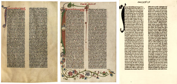
Three copies of the beginning of Genesis in the Gutenberg Bible. Note the different illuminations, which were individually added to the printed pages. Left: The Grenville copy (British Museum). Center: The King's Copy (British Museum). Right: Unknown copy (from a black and white photograph; the initial "I" is in multiple colours, and some of the text may be as well). Observe that the heading "Genesis" was added by hand in two of the three copies, and that each book has different lettering colours, etc.
It has been stated (I do not know on what basis; I have a feeling that it was calculated by dividing the estimated number of copies by the amount Fust lent Gutenberg) -- that the Mainz Vulgate sold for 30 florins. A very high price, certainly, equal to several years' wages for a craftsman. But hardly exorbitant when compared against the price of a manuscript copy of a full Bible, and the rate of errors was presumably lower.
Curiously, the Gutenberg Bibles that survive rarely show signs of heavy use. Indeed, other than being illuminated, it appears that only about a quarter were used at all. They weren't use-Bibles; from the very start, they were show-Bibles -- lectern copies, pulpit-Bibles, or the like.
Textually, the Gutenberg Bible is said to have been close to the Paris recension of the Vulgate, which is by far the most common form of the Vulgate. It is reported to be a good representative of that type (and my own limited checks seem to support this, although there are some places where the Paris text divides and Mainz goes with the minority) -- but that was still a late recension (thirteenth century), with many corruptions.
Incidentally, it was many years before books truly became standardized in the sense that all copies were identical. In 1572, John Day printed Matthew Parker's De Antiquitate Britannicae Ecclesiae, of which 25 copies are said to survive, no two of them the same. And the copies of the famous First Folio of Shakespeare are also all different, as various errors were corrected throughout the press run but the old sheets retained and used. This is parallel to the case of page II.323 of the Mainz Vulgate.
If the history of that first full-fledged printed book is obscure, the aftermath is known. It is almost certain that Gutenberg, if he did produce that first Bible, was financed by one Johann Fust and assisted by Fust's future son-in-law Peter Schoeffer. Fust, unhappy with Gutenberg's practices, apparently eventually called in his loans, took over Gutenberg's machinery, and went into business for himself, retaining Schoeffer to handle the technical details. The result of this was the so-called "Mainz Psalter," with a colophon mentioning the two printers and a date of 1457. (Some have thought that Gutenberg did the actual design work on this volume, but I know of no supporting evidence for this.) This volume was noteworthy, among other things, for its use of printed decorative initials in multiple colours -- a process still not entirely understood; the best guess is that the initials were done with two-part woodcuts, which could be lifted out so that each part could be separately coloured. However they managed, the result is very impressive: Black and red on every page, with musical notation, and red and blue initial letters.
By 1460, we see our first book with full bibliographic data, an edition of Balbus's Catholicon, which has a colophon stating that it was printed in Mainz in that year ("annis Mccc lx") "without... reed, stylus, or pen."
Unfortunately for the people of Mainz, but fortunately for the rest of the world, that city had been in the grip of civic conflict for many years due to poor management and bad fiscal practices (indeed, Gutenberg seems to have fled for years, returning some time between 1444 and 1448). And though there was calm at the time Gutenberg began his work, the city was gripped by civic conflict in the late 1450s and early 1460s as two rivals strove to gain the archbishopric. It appears that this conflict caused several printers to flee from the city, helping to spread the new technology. Gutenberg himself very possibly died in exile in the small town of Eltville, where he had relatives and where, interestingly enough, printing started very early.
The spread of printing thereafter was quite rapid. By 1460, an exile from Mainz (possibly Gutenberg himself, after the city was sacked and many residents driven into exile) had started a printing house in Bamberg and produced what is known as the 36-line Bible.
Bamburg was responsible another innovation: The first illustrated book printed with movable type. Albrecht Pfister of Bamburg produced multiple editions of several illustrated books, starting in 1460, and using the same type as was used for the 36-line Bible (though he probably is not responsible for that book). The first illustrated book is believed to have been Edelstein. The illustrations seem to have been woodcuts -- copperplate engraving was already known, according to McMurtrie, pp. 264-265, but this presented technical difficulties extreme enough that such intaglio printing was rarely attempted by printers, and no printer seems to have tried it twice. The problem was that, whereas ink would adhere to wood, so that it was sufficient to simply engrave the wood and print with it, ink did not adhere to metal, so there was no easy way to make ink print from only the raised portions. Even the earliest woodcut illustrations clearly were not printed at the same time as the text, since what is believed to be the earliest of Pfister's books has blank areas in the spot where the woodcuts would go in other copies (McMurtrie, p. 239), and there are also instances where the illustration and the text are overprinted when the paper mis-aligned (McMurtrie, p. 242, shows an example). These earliest woodcuts were apparently designed to have additional colors added by hand (a primitive form of paint-by-number), and most copies have been so colored (McMurtrie, p. 241). McMurtrie, p. 242, says that the first book with text and illustrations printed at the same time was published in 1472. (Amazingly, the first colour illustrations were printed as early as 1487, according to McMurtrie, p. 244 -- though this is a lesser innovation given the earlier use of multi-colored lettering; it was merely a matter of combining that technique with the techniques for printing woodcuts.) Interestingly, textual ornaments (or "dingbats") seem to have come into use after the use of woodcut illustrations; the earliest samples of type ornaments seem to have been printed in Verona in 1478, in a style still in use today; these elements could also be used as page borders. The obvious advantage of ornaments is that they could be cast in type and used repeatedly.
(McMurtrie, p. 283ff., notes another problem of this early period: The printing of mathematical texts. A volume of Euclid simply had to be illustrated -- and with a mixture of graphics and text. This made it hard to use woodcuts. Erhard Ratdolt of Venice seems to have published the first printed edition of Euclid in 1482; I rather suspect that the need to illustrate such books pushed the development of engraved printing of artwork. It is possible that Ratdolt's Euclid was not the first book with mathematical diagrams, but it was among the first, and the trendsetter. Ratdolt, incidentally, shows how quickly typography had advanced in the third of a century since Gutenberg. A specimen sheet he put out in 1486 features 14 fonts, representing four different faces -- including a nine fonts of a rotunda, three of a Roman, and a Greek; all, except for the smaller sizes of the rotunda, are beautifully clear.)
We gradually see innovations in these early years. The first title page seems to have been produced by Fust and Schoffer in 1463. The first instance of numbered folios was in a 1470 edition of De Civitas Dei produced by the brothers Johannes and Wendelin de Spira.
Strasbourg also seems to have housed a printer by the 1460s, Johann Mentelin (possibly an associate of Gutenberg in his wanderings -- Gutenberg, if we can
follow his many aliases, lived in Strasbourg before 1444), who produced his own Bible by 1460 and who also earns credit for the first vernacular printed Bible (a German edition regarded as a very poor translation, full of silly errors, but it was still in German rather than Latin). Augsburg saw books produced by Gunther Zainer probably from 1468. Anton Koberger was printing books at Nuremberg around 1470. Arnold Ther Hoernen and Ulrich Zell were in business in Cologne by about that time. Charles VII of France tried to set up a press operated by Nicolas Jenson; the attempt failed and Jenson went to Venice, but
France managed to attract a group of German printers in 1470. There were already presses in Rome and Venice and other parts of what is now Italy. It is not really possible to establish when printing came to the Netherlands, because of the work of Coster, but it was certainly by 1473. The Spanish had their first printing houses soon thereafter. In 1476, Ulrich Han published the Missale Romanum, richly endowed with music notation -- though McMurtrie, p. 286, says that woodblocks were first used to print music in 1487; Han's method was
to print text and music in separate impressions (and so complex is musical typesetting that, though fonts were eventually developed for it, it continued to be set primarily by hand right into the 1980s!). And, some time before 1475, William Caxton (in order to meet the demand for his translation of Raoul Le Fèvre's history of Troy), opened the first English printing shop. (Some sources, including McMurtrie, p. 216 say that this first book was printed in the Netherlands. This seems likely enough, but Caxton certainly ended his career in England.)
Caxton was a very conservative printer, usually technologically behind the times -- e.g. that first English book, the Recueil des histoires de Troies, puts line breaks in the middle of words, just as the early uncial manuscripts did! Caxton's successor Wynkyn de Worde was equally out-of-date (McMurtrie, p. 222, declares "Caxton could not by any stretch of the imagination be regarded as a fine printer... his work was, technically and artistically, below the standards of his continental contemporaries"), but they did make at least one advance: They published books, usually in the vernacular, for popular rather than scholarly consumption. (Not only did Caxton publish the first English secular works, the first secular French works are thought to have been printed by Caxton in cooperation with Collard Mansion, according to George D. Painter, William Caxton: A Biography, 1976/first American edition, Putnam, 1997, pp. 72-79.) The scholarly market was quickly overcrowded after the invention of printing; it has been estimated that the number of printers more than quintupled from 1470 to 1480 (from about 16 to 85 or so), causing saturation of the market for learned books -- McMurtrie, p. 313, says that there were over 300 editions of the works of Thomas Aquinas published before 1500, and on p. 318, he says that there were more than 300 printings of Cicero. Based on the figures on p. 323, there were over 40,000 different editions released by 1500. If we estimate that 75% of these were scholarly (surely a low estimate) and that the standard print run was 200 (also low), then that means that six million scholarly volumes were in circulation -- obviously an oversupply in a world where few except monks were scholars. The inevitable result was a collapse in the price of scholarly books -- meaning that there had to be something else published. There had been vernacular works before Caxton (in fact, we have a fragment of a Sybilline Prophecy in German in the Donatus-Calendar type, so Gutenberg may have been printing in German even before the Mainz Vulgate), but these had all been incidental. For example, McMurtrie, p. 202, says that 98 books printed by Jenson are known. Of these, 29 were theological books of some sort or other, 25 were classics, and most of the rest seem to have been references; only one, Boccaccio's Fiametta, could be considered a work for general consumption. McMurtrie, p. 320, estimates that 45% of books printed before 1500 were on religious topics, 10% were legal, 10% involved what passed for science, 30% were (presumably mostly classical) literature, and only 5% were general or popular. Whereas Caxton early on published an edition of Chaucer, and the Morte d'Arthur, and, frankly, a lot of things more interesting than the obscure Bible commentaries everyone else was churning out. (Though some, like The Game and Pleye of the Chesse, despite its title, were "edifying" books -- Caxton's Chesse was not about chess, but a sort of moral instruction in which the various classes in society were equated with chess pieces.)
The first book unquestionably published in England was The Dictes or Sayengis of the Philosophers, which seems to have come off the press in 1477. It was not a particularly long or ambitious book -- 76 leaves, or 152 pages. Here Caxton seems to have been trying for noble patronage -- the book was compiled by Anthony Woodville, Earl Rivers, the oldest brother of Queen Elizabeth Woodville. But Caxton's first edition of Chaucer followed the next year, and the popular book trade seems to have become established as a result.
Just as cities like Venice and Basel had quickly been mobbed by printers, Caxton soon had competition; Theodoric Rood began printing at Oxford in 1478, and apparently someone was in business in St. Albans by 1480. Printing also began in London in that year (McMurtrie, pp. 222-224). But Caxton is still considered the most important, both because he was the first and because he printed more important books. He was able to stay in business until his death in 1491, and Wynken de Worde (who joined the company in 1480) kept the company in business for another four decades. De Worde's output was often even more popular than Caxton's -- e.g. he produced one of the two earliest printed versions of the very popular Gest of Robyn Hode, the first printed tale of England's most famous outlaw.
The heavy competition which Caxton largely dodged by producing popular works produced a sort of an arms race in the scholarly book trade as each printer struggled to make books cheaper or more attractive. In this case, Jenson took a crucial step and, in effect, rediscovered the alphabet. The desire to produce manuscripts more quickly had led to the development of a vast collection of contractions, suspensions, and ligatures which made things faster for a trained scribe but which really did nothing for legibility -- and which made it much harder to create good type fonts, as they needed to include hundreds of symbols with no real meaning. The illustration below shows this point:
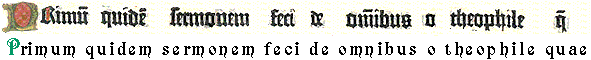
The Excesses of Early Printing: The first nine words of Acts 1.1 as it appears in the Gutenberg Bible and as we would write it today. Note the suspended "m" (ē=em) at the end of "primum" and "quidem," the single ligature for "de," the suspended "n" (m̅=mn) in "omnibus," and the abbreviation used for "quae" (q̅=quae) To set this line using a true alphabet requires 18 symbols. Gutenberg, even if we ignore the initial fancy letterforms, required 23 different symbols. (It is calculated that the Mainz Vulgate used 290 different letterforms -- some of them simply different widths of the same letter to allow lines to be fully justified. The complete set included 47 capital letters, 63 minuscules, 92 abbreviations, 83 ligatures, and five punctuation marks.) bEarly Greek printing used even larger character sets.
Jenson's innovation, in addition to making it easier to create a font, also made the type case a much more practical item. In assessing printed works, however, we should be aware that the type case was not much like a modern typewriter or word processor or much of anything else. The diagram below approximates the type case shown on p. 53 of Chappell (some of the characters are not found in the modern character set; other printers used somewhat different cases. Most cases agreed in having the UPPER CASE LETTERS and SMALL CAPS in the upper case, with equal-sized sections for each letter, but putting the more commonly used lower case letters in the lower case with variable-sized sections. I strongly doubt all early type cases included fractions, but I don't know what was in their place).
| * | † | ‡ | § | || | ¶ | ☞ | ℔ | ℘ | @ | % | a/c | / | ° | |
| ¼ | ½ | ¾ | ⅛ | ⅜ | ⅝ | ⅞ | $ | £ | 2 em | 3 em | ⎩ | ⎨ | ⎧ | |
| ⅓ | ⅔ | & | Æ | Œ | æ | œ | — | – | 2 em | 3 em | & | Æ | Œ | |
| A | B | C | D | E | F | G | A | B | C | D | E | F | G | |
| H | I | K | L | M | N | O | H | I | K | L | M | N | O | |
| P | Q | R | S | T | V | W | P | Q | R | S | T | V | W | |
| X | Y | Z | J | U | ] | ) | X | Y | Z | J | U | ffl |
| ffi | fl | 5 em | 4 em | ’ | k | e | 1 | 2 | 3 | 4 | 5 | 6 | 7 | 8 | |
| j | b | c | d | i | s | f | g | ff | 9 | ||||||
| ? | fi | 0 | |||||||||||||
| ! | l | m | n | h | o | y | p | w | , | En Quads | Em Quads | ||||
| z | |||||||||||||||
| x | v | u | t | 3 em space | a | r | ; | : | Quads | ||||||
| q | • | - | |||||||||||||
The mechanics of typesetting have affected out language in several ways. Note, for instance, that there are two cases of type. The one on top -- which was generally the upper case of the two -- contains the CAPITAL LETTERS; the case on the bottom contains the small letters. Hence the terms UPPER CASE for what might otherwise be called uncial letter forms, while forms derived more from minuscule writing are called lower case because they were in the lower (type) case.
Note that these cases had to be filled with type, and the person responsible for filling or refilling the case might make a mistake. This resulted in what was called a "foul case," and is one possibly source of typographical errors.
Interestingly, while Roman type cases became standardized, Greek cases never did. This probably didn't affect Greek printing very much, since typesetters didn't change jobs very often and so wouldn't have to re-learn the case layout, but it could occasionally matter.
In addition to being rationalized, Jenson's type also had a much more even "color" than his competitors -- that is, Jenson's pages all had about the same amount of ink per unit area. This sounds relatively minor, and it was minor from a production standpoint. but it really does produce a much more attractive page. A page in Jenson's type is also lighter than the pages of the Gutenberg Bible, which again makes it more attractive.
Jenson is sometimes credited with producing the first Greek publication. This, however, seems to be an exaggeration; Jenson may have produced the first full font of Greek type, but experiments had been done earlier. The first attempts to print Greek seem to have been made in 1465. Peter Schoffer was one of the first to try it; it was a simple disaster. McMurtrie, p. 279, concludes that Schoffer did not know Greek; he cut perhaps a dozen Greek letterforms and used Latin letters for the rest. In 1470 he reportedly simply used the Latin letter which looked the most like the Greek letter, which naturally produced very strange results.
In the same year, however, an edition of Lactantius was produced by Sweynheyn and Pannartz, which required substantial amounts of Greek. When they began printing, they evidently were not ready for the task they took on, and simply left space to include Greek words. By the time they finished the book, though, they had managed to cut many attactive letters of Greek type. (The overall feel is quite similar to that of the Complutensian Polyglot, though some individual letterforms were distinct.) The one thing this font lacked is accents, which still had to be added by hand.
Then, in 1470/1, Jenson created the first complete Greek font. He seems to have used this for an edition of Cicero. A similar face was used for what McMurtrie, p. 279, believes to have been the first full book printed in Greek, Thomas Ferrandus's edition of the Battle of the Frogs and the Mice, printed about 1474. Lascaris's grammar is the first printed Greek textbook, published by Dionysus Paravisinus in 1476. This uses a very strange font -- the section headings are printed in a style similar to the very latest uncials such as S, but the body copy is in a very messy semi-minuscule style; when I first glanced at the sample on page 281 on McMurtrie, I frankly thought it was hand-written by a not very good scribe. I suspect the person casting the typle was not especially familiar with Greek. Certainly there isn't much Jenson influence in that face.
Jenson's own Greek font was -- like most of his work -- simple and quite elegant. Sadly, his example in this regard was not followed; the next great printer of Greek works, Aldus Manutius of Venice, used typefaces similar to hand-written Greek, meaning that he needed over 500 separate symbols. (McMurtrie, in fact, says on p. 280 that Aldus's first Greek font contained over 1400 glyphs. The result, he comments acidly, was that "one of the most beautiful of all the world's languages continued to appear in an almost illegible and hideous printed form for some two hundred and fifty years." This is surely one of the reasons, though only one, why the first edition of the Textus Receptus was so disastrously error-ridden.) This excess of typographic detail is ironic, given that Manutius's goal was to produce relatively inexpensive hand editions of the classics. But the Aldine fonts were more compact and used smaller point sizes than Jenson's works, so the savings in paper probably offset the additional typesetting costs. The problem was that future typesetters followed Aldus, not Jenson. (According to McMurtrie, pp. 280-282, this was actually mandated by law in France, where the type face to be used for Greek was specified; the Greek font used by Robert Estienne contained 430 different glyphs.) The Complutensian Polyglot was one of the few early works to use a Jenson-like alphabet rather than imitate the Aldine press in all its needless complexity; McMurtrie, p. 282, says that it was not until 1756 that a decent Greek font became widespread.
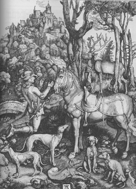
This shows the curiously convoluted way in which printing advanced. Printing in Greek should have been easy, while it should have been hard to create fine art in print. But Greek in fact took decades, whereas by the 1490s, Albrecht Dürer was producing fine engraved images of a quality that has not been exceeded to this day -- see, for instance, the Dürer engraving at right, "St. Hubert praying before a Cross borne by a stag."
Hebrew printing seems to have arisen shortly after Greek printing, and took off much faster. The first Hebrew printed book, according to McMurtrie, p. 282, was produced in Venice in probably 1484-1485. This was much more similar to modern printed Hebrew than the early Greek books were to modern Greek publication.
(For those who really care, the font models used by both Jenson and Aldus have been perpetuated. Jenson, of course, inspired the modern Jenson face. Aldus, who is largely responsible for italic type, provided models for such faces as Bembo and the original Garamond, though most versions of the latter are now much deteriorated. Aldus also has the curious distinction, according to McMurtrie, p. 213, of being the first to seek to have his typefaces protected by law -- not exactly copyright, but getting there. He also tried to get what amounted to a trademark on his company's name -- apparently printers in other countries were making cheap knock-offs of his publications and sticking Aldus's name on them. Manutius understandably wanted to protect the reputation of the Aldine name.)
Despite his ugly fonts, Manutius deserves great credit for establishing standards for the printing of Greek -- as well as other languages. From 1494, he printed works of Aristotle, Vergil, Dante -- and, of course, the LXX. The Aldine press was noteworthy not just for its innovations but its scholarship -- establishing, arguably for the first time, the standards which we now consider necessary for a published work. A printed book, after all, exists in many copies; it should be prepared with extra attention compared with a single manuscript copy -- especially since it is much harder to set, since hand-set type must be placed in the forme backward.
Printing of course established other standards -- e.g. distinguishing the letters i and j, as well as u and v. S. H. Steinberg's Five Hundred Years of Printing (revised edition by John Trevitt, p. 31) attributes this distinction to poet Giangiorio Trissino and credits the printer Ludovico degli Arrighi with perpetuating it. McMurtrie, p. 299, credits Matthias Schürer of Strasbourg with inventing quotation marks and standardizing the form of the question mark in Latin-alphabet printing.
Incidentally, printing perhaps gave a small boost to women's rights. Charlotte Guillard of Paris married two printers in succession; after the death of the second, she continued in business on her own, making her napparently the first independent female printer. She died in 1556, and declared that she had been in the printing business for 54 years (though some of that, of course, was before she took charge on her own).
The evolution of type was not always a direct line from Gutenberg to today. A lot of strange characters went into the type faces before being pulled out. Joseph Moxon, for instance, in 1683 had a type case that included ♄ ♃ ♂ ☉ ♀ ☿ ☽ ♈ ♉ ♋ ♍ ♏ ♐ ♑ ♒ ♓ and some others that I can't even locate in the unicode symbol set -- things you might need once in a great while for a scientific or astrological text, but surely useless for ordinary work!
For all that Mainz gave rise to printing, and Venice did much to perfect it, the most important city for our NT criticism purposes is probably Basel, where Berthold Ruppel was in business by 1468. Albrecht Dürer, already cited as the first truly great illustrator of books, worked in Basel seemingly from 1492-1494. Also working at Basel was Johann Amerbach, who seems to have gone into business around 1478. And one of his pupils was Johann Froben.
Froben has a bad reputation in New Testament circles because he hurried the Textus Receptus through the press. This is rather unfair; it's true that Froben produced a hurried edition, but he also produced an affordable edition (which hardly describes the competing effort of Cardinal Ximenes), and he did call upon Erasmus -- who was, after all, the leading scholar of the time -- to produce it. If Froben had not imitated the Aldine typography in all its intricacies, that first Greek Bible might not have been so badly printed (and while the text wasn bad, would a Complutensian standard for the New Testament really have been any better?). Froben also deserves some credit for producing an inexpensive octavo edition of the Vulgate in 1491; it has been called the "poor man's Bible." (Though it required a poor man with very good eyes; the reproduction on p. 307 of McMurtrie shows a page printed in about six point blackletter type. It may be the most illegible printed book I've ever seen.) He also worked hard to produce a critical Vulgate; it is said that his is the only early edition to have the original readings at many points. If others made ill use of his New Testament, he nonetheless deserves credit for trying to produce good and valuable materials.
It is interesting to find the two earliest Greek New Testaments printed in Spain and Switzerland; until that time, according to McMurtrie, p. 321, almost all Greek printing had been done in Italy (where Byzantine refugees knew the language). But perhaps the power of the Papacy discouraged the creation of Greek New Testaments in Italy.
We should perhaps note that many of the tools used in textual criticism of manuscripts also apply to textual criticism of books. Not all ancient books survive intact; indeed, most of the earliest ones suffered enough wear and tear that they were good for nothing but to be used in the bindings of other books. So what survives is a page here and a page there, with no date even if the book originally had a dated title page (and, as noted above, not all did -- nor were they reliable when they did). And the value of a book can vary with its date; if an edition of some work can be dated to the beginning of the printing era, then it surely comes from a manuscript source, and that manuscript might have been good.
Several indications can be used to date books. Type is one of these. The Mainz Vulgate, for instance, is printed in a heavy "Textura" type -- the earliest form of what we now call "blackletter." The reason for the name "blackletter" is obvious if you look at a page of the stuff: The very narrow letters with the large clubbed serifs mean that a page printed in this style is very dark (and not welcoming to the eye. For all the beauty of the Mainz Vulgate, the "Bastarda" style of the Donatus-Calendar font was probably easier to read). Textura types eventually evolved into Fraktur letterforms (generally similar in shape but with smaller serifs and strokes which narrow when the vertical strokes are long). A fairly early variation on this was the Humanistica type, with similarly narrow letters but lighter strokes and smaller serifs (think of Textura written with a ball point pen). By 1465, Sweynheym and Pannartz were using a font with many aspects of modern type, although it required using an exceptionally large character set. Soon after, printers like Jenson evolved our ordinary modern Roman type. The Aldine press gave us italics -- which were not originally used to emphasize text; whole books were set in these fonts. Gothic types were developed around the same time to save space. This probably isn't the place to go into full details (since little of this is likely to be used in ordinary textual criticism), but the data is accessible if needed. (Dating-by-typeface worked for about 200 years. After that, things became a lot more complicated: there would come a time when some scholarly books would be printed in antique typefaces just to make them seem older and more archaic. The title page would give the actual date, but apparently the publishers thought appearances more convincing than actual facts.)
The close links all these books have with biblical scholarship is shown by the title given to them: Books printed before 1500 are known as incunabula, a word connected with the cloths used to wrap Jesus in his infancy (though the Vulgate of Luke 2:12 does not in fact use incunabula). We should note that the singular incunabulum found in some references is a false singular.
An interesting problem with early books is the lack of copyright. Manuscripts of course were never copyrighted, so the need for protection for printers (let alone payment of royalties) was not at first realized. The effect of this was that any publication could be pirated -- as, e.g., the 1518 Aldine edition of the Greek Bible is essentially a copy of Erasmus's New Testament, right down to the more blatant typographical errors. Nor was that the worst case of bad copying known. In the case of Shakespeare's "Titus Andronicus," the so-called "second quarto" (Q2) was set from an earlier edition, Q1, which had several defective pages -- and the editors, rather than find another copy of Q1, just made up their own version of the text. (They couldn't go back to the original plates, of course; as with all books at that time, the plates had been disassembled so the type could be reused.) And if authors were paid for their work at all, it was in the form of what we would now call an advance, such as Erasmus received from Froben.
The first move toward a limited copyright system came in England in 1504, when Henry VII created a post of Printer to the King, with some rights to what was printed. In 1518, Richard Pynson was granted sole rights to print the Oratio Richardi Paeci for two years. Over the next several years, protections were granted for specific books, but no general system was instituted until the creation of the Stationer's Company in 1557, which controlled what was printed -- and policed it; printers who produced unregistered books were fined. This was, of course, still "printer's copyright" -- the printer had control over the book. And it was a true copyright -- so strong that, if a printer registered a book, no one else could print it even if the printer never actually published it. This seems to have happened with Shakespeare's "As You Like It," among others; a copy was registered probably in 1600, but it was never published until the First Folio almost a quarter of a century later. Books at this time had to go through two steps for approval: a book had to be "allowed," i.e. accepted by the church (or a relevant secular authority, in the case of plays), and then the Stationer's Company had to let it be printed. The first step said that the contents were acceptable (with the main concern being heresy; obscenity was suppressed, but mere sexual content usually allowed, so Shakespeare was able to publish Venus and Adonis and The Rape of Lucrece); the second said that the publishers had the right to print the work. Prior to 1637, entry into the Stationer's Register was not mandatory (so a work need not be copyrighted), but even before that, the registering organization controlled the work.
"Stationers" was a technical term arising probably in the fourteenth century, when scribes began to specialize, as Writers of Court Letters and Writers of Text Letters (in essence, legal secretaries and copiers of books). The latter, joined by the illustrators and binders, went on to become the stationers -- in effect, the guild of publishers. Before the printing era, their role was relatively slight, but obviously printing changed that. (This is the reason it took until 1557 to form the Stationer's Company; the printers originally belonged to several guilds, and it too some time to combine them -- an earlier attempt to incorporate, in 1542, had failed.) In 1586, the Stationers gained some government privileges to enforce their rules. (The legal secretaries would form the Guild of Scriveners in 1617, but although similarly organized, the Scriveners were much smaller and were of little interest to us, since they did not make books and only rarely made copies of older works.)
Unfortunately, if the Stationer's Company provided copyright (which tended to suppress corrupt editions, even though it had other faults), and if it served as a sort of guild for printers, it also had the right to censor works, just as the government did. (Something much easier to enforce in England, where all the printers seemed to settle in London and Westminster, than in Germany or even France.) Much that might have been useful to us now was no doubt stranded in manuscript form. Though this was nothing compared to the censorship applied in other countries later (as, e.g., in Austria-Hungary in the nineteenth century).
The Stationer's Company, as mentioned above, also enforced a limit on the size of print runs, usually to 1000 copies. The purpose of this was to ensure continued employment for typesetters -- but the effect was to ensure the corruption of popular books, because, again, the type was broken up after each edition (indeed, usually after each quire) was printed, and on those occasions when the book was reprinted, it was almost always reprinted from a copy of the previous edition, meaning that errors multiplied with each generation. (To take an extreme example, there were six consecutive quartos of Shakespeare's "Henry IV, Part I," designated Q0, Q1, Q2, Q3, Q4, and Q5, each one printed from the one before, with the First Folio and another quarto, Q6, adapted from Q5. By the time they got to Q6, the result was pretty badly corrupt.)
By the time of Shakespeare, of course, we are past the era when most classical works were first printed, so the later history of copyright isn't of much interest directly. But we might as well sketch a little of it. It was in 1709 that copyright finally started to apply to authors. Copyright by that time was granted to the printer for fourteen years, but at the end of that time, ownership reverted to the author, who was permitted to re-sell his work as he chose. This also prevented any attempts at permanent copyright -- an unmitigated evil in scholarly fields which has effectively come back under current law (current copyright typically lasts about a century), but without the compulsory licensing provisions of the seventeenth century law: Back then, copyright applied only to people who kept books in print.
The eighteenth century finally saw a regularization of type and type sizes; it was Pierre Fournier who introduced the point system in 1737 (Chappell, p. 51). This didn't really affect the text of printed works, but it did help somewhat in dating them.
To sum up our history, it is often stated that the arrival of printing spelled the end of the need for textual criticism. This is largely (though not entirely) true. But this hardly makes the invention of printing a problem for textual critics; in truth, it is only the inventing of printing that makes the discipline possible -- for it is only now that all scholars can have access to transcripts of the most important manuscripts, and only now that they can publish the reports describing their methods so that all can adopt or reject them. It has been said, truly, that printing made modern science possible. Textual criticism isn't really a science. But it benefitted just as much.
Textual criticism of printed works. It's worth noting that printed books will contain different sorts of errors than manuscripts. A manuscript will contain errors of sight and of memory (or of hearing, if taken from dictation). These errors can, of course, occur in printed works, since they derive from manuscripts -- plus typesetters might simply mis-remember what they read. But one sees whole new classes of mechanical errors. For example, type was composed backward on a compositor's stick. (Which, despite its name, was not a stick; rather, it was a box with a clamp which allowed it to be set to a specific column width, in which the type was placed before being moved as a block; see the graphic below.) So it is perfectly reasonable and understandable to see letters set backward; in some cases, they might also be inserted upside-down (which could cause confusion of, for instance, p and d). Again, type was taken from a type tray, not hand-written. The compositor might pull out the wrong letter -- or, perhaps, the person who filed the type might have placed a letter in the wrong bin. (This is believed to be the origin of the phrase being "out of sorts" -- the type was not sorted into the right place.) So one will occasionally see random substitution of letters -- an unusual outcome in dealing with manuscripts. One also gets peculiar errors of the press -- as, e.g., when something falls on the press and prevents the paper from taking an impression (this frequently affects only a few copies of the book, but if only one copy survives, that's no consolation).
| A Compositing Stick |

|
Another curiosity of typesetting is the way it handled spaces. To prevent type from shifting, a space was an actual character in type -- and there were typically three types of spaces, which might be called Thick, Mid, and Thin. It was normal to set a line with Mids, and if it didn't justify, then replace a few Mids with Thicks or Thins, as needed. The alternate spaces were not deployed randomly; a compositor would try, for instance, to use Thins between letters where the letters themselves did not push the boundaries of their space very much -- e.g. a Thin would likely be placed between "now one" rather than "then many." This substitution of spaces after the preliminary setting of the line produced occasional odd errors.
Identifying compositors can be an important part of textual criticism of printed works (an immense amount of effort has gone into identifying the typesetters of Shakespeare's First Folio, for instance), but it is obviously a much harder task than identifying scribes who copied manuscripts; if multiple compositors work on the same book, the typeface will nonetheless be the same. There are tools that sometimes help, however. Mark Bland, A Guide to Early Printed Books and Manuscripts, offers rules and conditions that must be followed to be certain that the identification is correct:
- The underlying text must be "neutral" -- that is, it must have uniform orthographic conventions, so that any divergences from that convention are due to the compositors, not their source. This will generally mean that one scribe copied and edited the source manuscript.
- At least one compositor must have a clearly distinctive style (such as a manner of spelling words. An example of this might be using "ye" or "þe" for "the.").
- If the document is prose and is printed with justified rather than ragged margins, spelling variants that might be used to aid in justification (e.g. work/worke, study/studey, the/thee) must be discounted.
- Analysis must be carried out line by line, not page by page, because compositors sometimes changed in the middle of a page. (I would add, however, that it is probably sufficient for initial purposes to work on samples from each page; one converts to line-to-line examination when one is seeking to find the place where compositors change).
- The type itself must be examined in detail to see if there are two (or more!) type cases in use.
- Attention must be paid to the layout of the page and the accuracy of the setting.
In making the determination, a good place to start may be the type case (cases may differ in how worn the type is, or in small details of a few letters, or possibly in their layout, causing different sorts of casual errors). Changing from one case to another does not automatically imply a change of compositors -- it may just have been that the workers got up and moved around! -- but it does mean that someone did something different.
(Type wear, incidentally, can be important in dating, too. There were quite a few early printers who would buy a font of type and use it until it was too worn to serve any more. If a font was new in, say, 1490, and so worn as to be almost beyond use in 1500, and you find a book printed in that font that is only slightly worn, it is probably to be dated closer to 1490 than 1500; if it is badly worn but still serviceable, it is later. The state of the type cannot give an exact date for a book unless there are many dated books printed with it, but it can sometimes be used to determine sequence.)
Printing could also have effects on the way languages were written. Early Middle English, for instance, used three letters not in the Roman alphabet, Ð/ð (eth), Þ/þ (thorn), and Ȝ/ȝ (yogh). By the fifteenth century, eth was out of use, but thorn (for th), and yogh (for all the various sounds we now spell gh) were going strong. But most typefaces didn't include these letters, so printers substituted in one way or another (using th or ƴ for thorn and gh or something for yogh). Gradually people started writing the letters in the way they were printed. But it should be kept in mind that a book typeset from manuscript might well have been converting þ and ȝ, and maybe even ð, into Roman letters, and might make mistakes of some sort as a result (especially with ȝ, which had several equivalents). Similar things might happen in other languages, e.g. German had to decide whether to use ß or ss.
Another interesting problem is that of changes in an edition. Corrections were often made in the course of a press run, without the earlier sheets being discarded (this was known as stop-press correction). In the case of a printed text, the revised version was almost certainly closer to the original than the first impression, since the source material was still at hand for consultation -- and while that source material might be very bad, a transcription with errors could only be worse. But the trick then becomes to determine which impression is the older and which is newer. Theoretically, if all copies of a book were bound in order (that is, if the first impression of sheet one were bound with the first impression of sheet two, etc.), this would be easy enough; one simply lines up all the changes and sees the order in which they occurred. But it doesn't work that way; often an early state of one quire will be bound with a late state of another. Determining the order of correction can be quite challenging in that case; I know of no absolutely assured mechanical way of reaching a conclusion (though it is often possible in practice because some of the changes will be simple corrections of obvious errors of the press, which can then be used to indicate the order of more significant changes). What's more, one must examine many copies to be sure one has found all possible stop-press corrections -- it is estimated that one must check about 80 copies to (almost) ensure complete detection of corrections. Fortunately, one can now use overlays (blink comparators; see below) to simplify the process of finding them.
One important thing to remember is the possibility of printed forgeries. This is rare now, particularly for modern books, because one generally wants the latest possible date for copyright reasons. It wasn't so in the past; just as a manuscript such as 1505 might have a fake colophon, it was not unusual for books to claim an earlier date. The second quarto of Shakespeare's The Merchant of Venice, printed in 1619, claims to have been printed in 1600 (the actual date of the first quarto; the publishers, I suppose, might have claimed to be duplicating their source, since they copied the first quarto, but it seems more likely that they were trying to make their book seem more valuable -- or even, it has been suggested, working to avoid a copyright lawsuit). An even more amusing instance occurs in the case of the book that eventually became Elizabeth Browning's Sonnets from the Portugese. In the mid-nineteenth century, there was a tendency for authors to produce small private runs of their writings. So when a print dated 1847 of the book showed up titled "Sonnets by E. B. B.," it produced a real excitement among rare book collectors. There was only one problem: Although one authority (Gosse 1894) dated the poems to 1847, more numerous and authoritative sources show that Browning did not reveal the poems to her husband until 1849 -- so there could be no 1847 edition. The "Sonnets by E.B.B." edition was a modern fake, based on Gosse's date.
One advantage in detecting this sort of thing is the fact that all copies of a single edition are, in theory, the same (except for the stop-press corrections, anyway). That forged edition of The Merchant of Venice was discovered by an interesting means derived from astronomy of all things: The blink comparator. Charleton Hinman, weary of hand collating copies of printed editions, thought to overlay photographs of individual copies and flashing back and forth between them. If the two manuscripts were identical at a particular point, the blink wouldn't be noticed. Where there was a change, one could see the page change its appearance. (It took a while to get this to really work, but the principle is fine -- and is how Pluto and a number of asteroids and comets have been found.) This technique let Hinman collate eight copies of Shakespeare's Othello in about six weeks -- about a twentieth of the time it would have taken otherwise, and probably with higher accuracy as well. (These days, we can do even better, subtracting one image from another in Photoshop or something similar; the only parts of the page that will even be visible are the parts that have changed.)
In the process of collating, Hinman discovered the Merchant of Venice forgery. This story is worth telling, even though it isn't properly a textual problem, simply because it shows us some potentially useful techniques.
The quarto editions of Shakespeare's plays were sold unbound -- they were small enough that the usual practice would be for the buyer to purchase several such small books and bind them together. Thus most of the surviving quartos were bound up with other books, not necessarily by Shakespeare. And yet, several volumes were known with the same nine Shakespeare quartos, with widely divergent dates: The Merchant of Venice, A Midsummer Night's Dream, and the inauthentic Sir John Oldcastle dated 1600; King Lear and Henry V dated 1608; and Pericles, The Merry Wives of Windsor, and the inauthentic A Yorkshire Tragedy dated 1619; plus the undated The Whole Contention (a bad conflation of Henry VI II and Henry VI III). The logical conclusion was that these nine plays were being sold at the same time -- hardly possibly if they were printed over a span of 19 years. William J. Neidig then set to looking at the nine quartos. Among other things, he superimposed the title page of Pericles (which admitted being printed in 1619) with that of The Merchant of Venice (which claimed a date of 1600).
The two layouts matched. The titles were different, of course, but the bottom part of the plates were identical except for the dates. This included even such details as the nicks in the type. There was no question: The title pages of Pericles and The Merchant of Venice were printed at the same time. In 1619, obviously. The dating on the Merchant of Venice quarto is false.
Early Printed Editions from Lost Manuscripts
The following list (which is very far from complete; it's just a sample to give some idea of the importance of the printed editions) describes some of the various ancient documents for which printed editions are essential tools of textual criticism.
Church Writers
Other Works of Significance to Biblical Criticism
- Josephus, Against Apion. All surviving manuscripts are derived from Codex Laurentianus of the eleventh century; the only other sources are the (poor) Latin translation and the extracts in Eusebius. The first edition (Basel, 1544) seems to have been checked against a now-lost manuscript.
- Josephus, Antiquities. As with the Against Apion, the Basel edition seems to have used a lost manuscript. The manuscript tradition for the Antiquities is much richer, so the Basel edition is of somewhat less importance, but it still has hints of a lost source.
Secular Works
- Asser, Life of Alfred. Only one copy survived to the era of printing: Cotton MS. Otho A.xii. This manuscript was almost completely destroyed in the library fire of October 23, 1731; no part of Asser's work survived. Various transcripts were made, but most are based on the printed editions: Matthew Parker's of 1574, Camden's of 1602, and Wise's of 1722. All of these are rather unreliable (Parker's was interpolated, and Wise had to work from a transcript he himself did not make), but with no other sources, they are obviously essential.
- Anonymous, The Battle of Malden. From the same Cotton MS. Otho A.xii as Asser (see supra), and equally lost. It was printed by Hearne from a transcription by Elphinston.
- The Gest of Robyn Hode, a Middle English metrical romance sometimes labelled as a ballad. There are no manuscripts; there are seven printed editions (only three of which survive in complete copies), although all the substantial printed editions (and perhaps the fragments as well) go back to two early editions, by Pynson (very fragmentary, although there a fuller but still-incomplete and very bad edition copied from it) and de Worde. Both source editions go back (probably with an intermediate stage or two) to a rather poor manuscript copy that was not the original.
- Thomas Usk, The Testament of Love, by a contemporary of Chaucer who was executed for his political activity. There are no manuscript copies; it is known only from the edition printed by Thynne among the works of Chaucer. It is extremely corrupt -- so corrupt that often no one can even suggest conjectural emendations. But it is still an interesting look into late fourteenth century attitudes.
- Chaucer, various works. The printed editions hardly matter for the Canterbury Tales, which exists in many manuscripts, but based on the textual notes in the Riverside Chaucer, all of the following writings have early printed editions of textual significance (though Caxton and Thynne, especiallly the latter, were often guilty of editorial tampering):
BOOK EDITION The House of Fame Caxton (1483), Thynne (1532) Anelida and Arcide Caxton (c. 1478) The Parliament of Fowls Caxton (c. 1478) Troilus and Criseyde Caxton (c.1483), Wynkyn de Worde (1517), Thynne (1532) The Legend of Good Women Thynne (1532) (Various short works) Caxton (c. 1478), Julian Notary (c. 1500), Thynne (1532), Stowe (1561), Speght (1602), etc. - The Coventry Mystery Plays. The sole manuscript of these religious pageants apparently dated from 1534, and has been burned. All we have is a printed transcript.
- The Finnsburg Fragment. A tiny bit text describing an event also mentioned in Beowulf. The volume containing the original fragment survives, but the fragment has disappeared from it and is known only from an edition (badly) edited by George Hickes.